
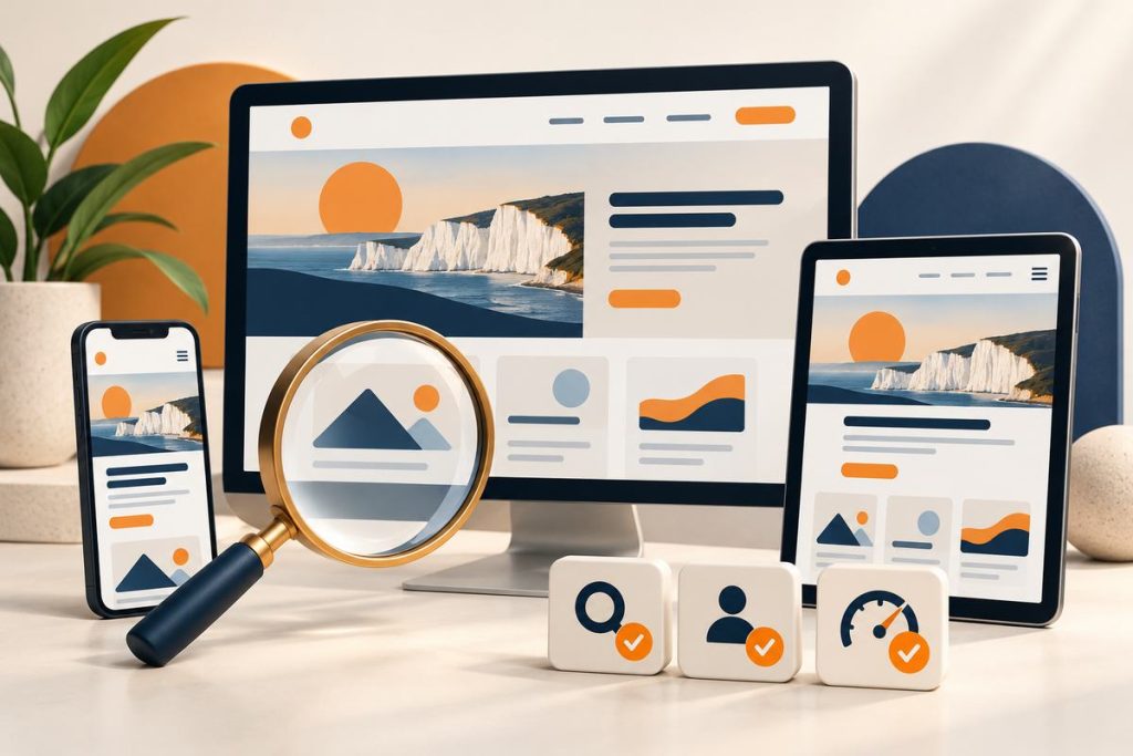
Your website looks great. Everyone around you acknowledges it. But almost nobody finds it on Google. Sound familiar? Many small business owners across the USA face this every day. The problem is often not the look. It is how the site is built. SEO friendly web design fixes that. It helps people and search engines use your site with ease. This blog shares website SEO best practices and simple SEO web design tips 2026 in easy words. By the end, you will learn what SEO friendly web design means, why it matters now, which design errors hurt you, and what to do instead.
What Is SEO-Friendly Website Design?
SEO friendly web design means building a website that people enjoy and search engines can read. Search engines, like Google, send small robots to visit your pages. If the robots can open and follow your pages, that is called crawlability. If they can then save your pages in Google’s big list, that is indexability. A clear website structure helps with both. Your site also needs to be easy for people to use. Good SEO friendly web design brings these things together without making the website harder to use.
Why Does Website Design Matter for SEO in 2026?
Design is not only about looks. It shapes how long people stay and whether they come back. Google research found that when a page loads in ten seconds instead of one, the chance a mobile visitor leaves goes up by 123%. Picture a shopper in Chicago, on a phone, standing in a long line. That person will not wait. Slow and messy pages lose them fast. Clear pages are also easier for AI search tools to read, so good design can help you show up in AI answers too. Trust matters as well. A clean, well-organized site tells a stranger in Brighton that a real business stands behind it. That trust turns a visit into a call. This is where mobile-friendly SEO design matters. Good website SEO starts with making the site easy for people to use.
Common On-Page Design Errors That Hurt SEO
Technical SEO for websites is mostly a developer’s job. On-page SEO for web design is different. It is about what your visitor sees and feels on the page. Here are ten design errors that weaken SEO friendly web design, and how to fix each one.
Cluttered, Confusing Layouts
Too Many Elements Competing for Attention
Picture a plumber’s homepage in New York with three sliders, five banners, and a chat box, all at once. The visitor does not know where to look. So they leave.
How a Clean Layout Keeps Visitors on the Page
Pick one main message for each screen. Add one clear button. Give everything else room. A calm layout is the base of SEO friendly web design. People stay longer on calm pages, and happy visitors are the kind of people Google wants to send to you.
Navigation That Frustrates Visitors
Menus With Too Many Options
A menu with fifteen links feels like a maze. Keep it to five to seven main links, like Home, Services, About, Blog, and Contact. Move the rest to the footer or inside other pages.
Pages Buried Too Deep to Find
If a visitor needs five clicks to reach your prices, they will give up. Keep key pages within three clicks of the home page. Here is a simple rule for how to design SEO optimized websites: if a person cannot find a page fast, Google will struggle too.
Layouts That Break on Mobile Screens
Text or Buttons That Don’t Resize Properly
Responsive web design SEO means your layout changes to fit any screen. Google recommends this setup because it is the easiest to build and keep up. A page made only for a laptop looks squeezed on a phone. Words get tiny. Buttons are hard to tap.
Content That Gets Cut Off or Overlaps
Check your site on a real phone, not just a computer preview. Look for words running off the edge, pictures covering text, or menus that will not open. Good mobile-friendly SEO design starts with these small checks.
Inconsistent Visual Hierarchy
Headings, Fonts, and Colors Used Randomly
One page has five fonts and six colors. The next page looks like a different company. It feels messy, and messy feels risky.
Visitors Can’t Tell What’s Most Important
Make the most important thing the biggest thing. Use size and color on purpose. A visitor should know in three seconds what you sell and what to do next.
Pop-Ups and Autoplay Media That Block Content
Full-Screen Pop-Ups on Page Load
A big box asking for an email before anyone reads a word is rude. On a phone, it can cover the whole screen. Many people just tap back. Wait until they have read something, then ask.
Videos or Sound That Start Without Warning
Someone opens your page at work or in an official gathering. A sudden sound makes them close it in one second. Let people press play on their own.
Cramped Text With No Breathing Room
Missing Whitespace Around Paragraphs
Whitespace is the empty space around your words. Good on-page SEO for web design keeps text easy to scan, and whitespace helps. It rests the eye. Walls of text make people scroll away.
Font Sizes Too Small to Read Comfortably
Many people read on phones without their glasses on. Small gray text is hard for them. Around 16 pixels is a safe start for body text.
Important Text Buried Inside Images
Offers or Info Only Visible in a Graphic
A banner says “20% off this Memorial Day weekend,” but the words are part of the picture. Search engines cannot read words inside pictures well. Screen readers may skip them too.
Why This Content Effectively Disappears
To Google and to blind visitors, that banner is just a picture. Type your offers as real text on the page. Put the image behind it or beside it.
Broken Structure After a Website Redesign
Pages That Quietly Disappear or Move
A redesign brings a new look, a new menu, and new page names. Old pages that ranked well can vanish when their web address changes. Before launch, list every old page and decide where it goes. Then use redirects, which work like mail forwarding, to send old addresses to new ones.
Dead Ends With No Links Pointing Anywhere
Some pages end up with no links to them. Nobody can reach them, so nobody finds them. After a redesign, click through the whole site like a new visitor. Check that every page is linked from at least one other page.
Designing the Look Before Planning the Content
Layouts Built Before Anyone Knows What Goes On Them
A designer makes a pretty template first. The words come later. Then they do not fit. Plan what people search for and what pages you need before you pick colors. This is a big part of how to design SEO optimized websites.
Squeezing Content Into a Design That Wasn’t Made for It
Forced text gets cut short or pushed to strange spots. Write the main content first, even as rough notes.
Layouts That Hide Key Info From AI Search Tools
Answers Buried Behind Tabs, Clicks, or Sliders
Some sites hide their best answers inside tabs, drop-downs, or sliders. People may miss them. AI tools can miss them too. Keep the key facts in view.
No Clear Summary Near the Top of the Page
Add a short, plain answer near the top. Two or three sentences saying who you help and what you do are enough. Visitors get it fast, and AI tools can read it easily.
How to design SEO optimized websites?
Fixing errors is half the job. The other half is showing that real people run your business. If you wonder how to design SEO optimized websites that earn trust, start here. Google looks for experience, expertise, authority, and trust, often called E-E-A-T. Website SEO best practices should make these qualities clear to both Google and your visitors.
Use Real Photos and Original Visuals
Everyone has seen the same smiling woman with a laptop. Visitors notice. A stock photo says anyone could have made this site. Use your phone. Take a photo of your team, your shop, your truck, or a finished job. A bakery in Austin can show real cakes on its real counter. Add short alt text, like “baker decorating a birthday cake in Austin,” so visitors and Google know what the photo shows.
Keep Visual Branding Consistent Across Every Page
Choose two or three colors and one or two fonts. Use them on every page. Keep your logo in the same corner. When pages look different, people wonder if they left your site.
Design Clear Calls-to-Action That Guide Visitors
Put your main button near the top. Add it again near the end of long pages. On phones, keep it where a thumb can reach. This small step supports responsive web design SEO because a page that is easy to use keeps people around. “Submit” says nothing. “Get My Free Quote” says a lot. Tell people what they get when they tap.
Make Trust Signals Part of the Design
Show your phone number, street address, and hours. Many customers in the USA look for a local address before they call. Add real reviews and a few team photos. On-page SEO for web design also means showing the proof people look for. Write an About page with real names, real faces, and how long you have been in business. Link it in your main menu. Google wants to know who is behind a site, and so do people.
Choose Readable Typography and Strong Color Contrast
Simple fonts work best. Skip fancy script fonts for body text. Light gray on white looks modern, but it is hard to read in bright sun. The W3C says normal text needs a contrast ratio of at least 4.5:1 against its background.
Design Around What Visitors Actually Came For
Website SEO best practices in 2026 are less about tricks and more about being useful. Ask what a person in your town wants when they land here. A roofer in Dallas needs storm repair details and a quick call button, not a long company history. Website optimization for SEO works best when you design for the real question. Every slider, icon, and animation must earn its spot. If it does not help someone read, choose, or call, remove it. Your pages will load faster too.
Conclusion
A nice-looking site is not enough. SEO friendly web design means building for real people first, then making sure search engines can follow along. Fix the design errors above, then add the trust builders. Try these SEO web design tips 2026 one at a time. At Brighton Ashbury, we help businesses across the USA build websites that look good and get found. If your site is not bringing in calls, we would be glad to look at it with you. Website optimization for SEO begins with one small step.
Why doesn’t my website rank even though it looks great?
Looks alone do not bring rankings. Google also checks if your pages are useful, quick, and easy to use on a phone. A pretty site can still hide problems, like pages nobody links to. Fix those first. Then give it time, because new sites can take months. Follow mobile-friendly SEO design rules too, since many visitors use phones.
Can a website builder like WordPress or Wix be SEO-friendly?
Yes. WordPress, Wix, Squarespace, and Shopify can all work. What matters is how the website is set up. Pick a light template that supports responsive web design SEO, and add real content. Technical SEO for websites is also easier on builders, because many settings are already handled for you.
Does redesigning my website hurt my SEO?
It can, if pages move without a plan. Keep a list of old pages, keep your best content, and forward old addresses to new ones. Website optimization for SEO should be part of the plan from day one. Watch your traffic each week for a month after launch.
What’s the difference between good design and SEO-friendly design?
Good design looks nice. SEO friendly web design looks nice and also works well. It loads fast, fits any phone, and uses real text a search engine can read. You need both for SEO friendly web design.